
LOCAL/
14:59
14:59
Mr Price x ODDITY: Market Day Bloom
Mr Price x ODDITY: Market Day Bloom
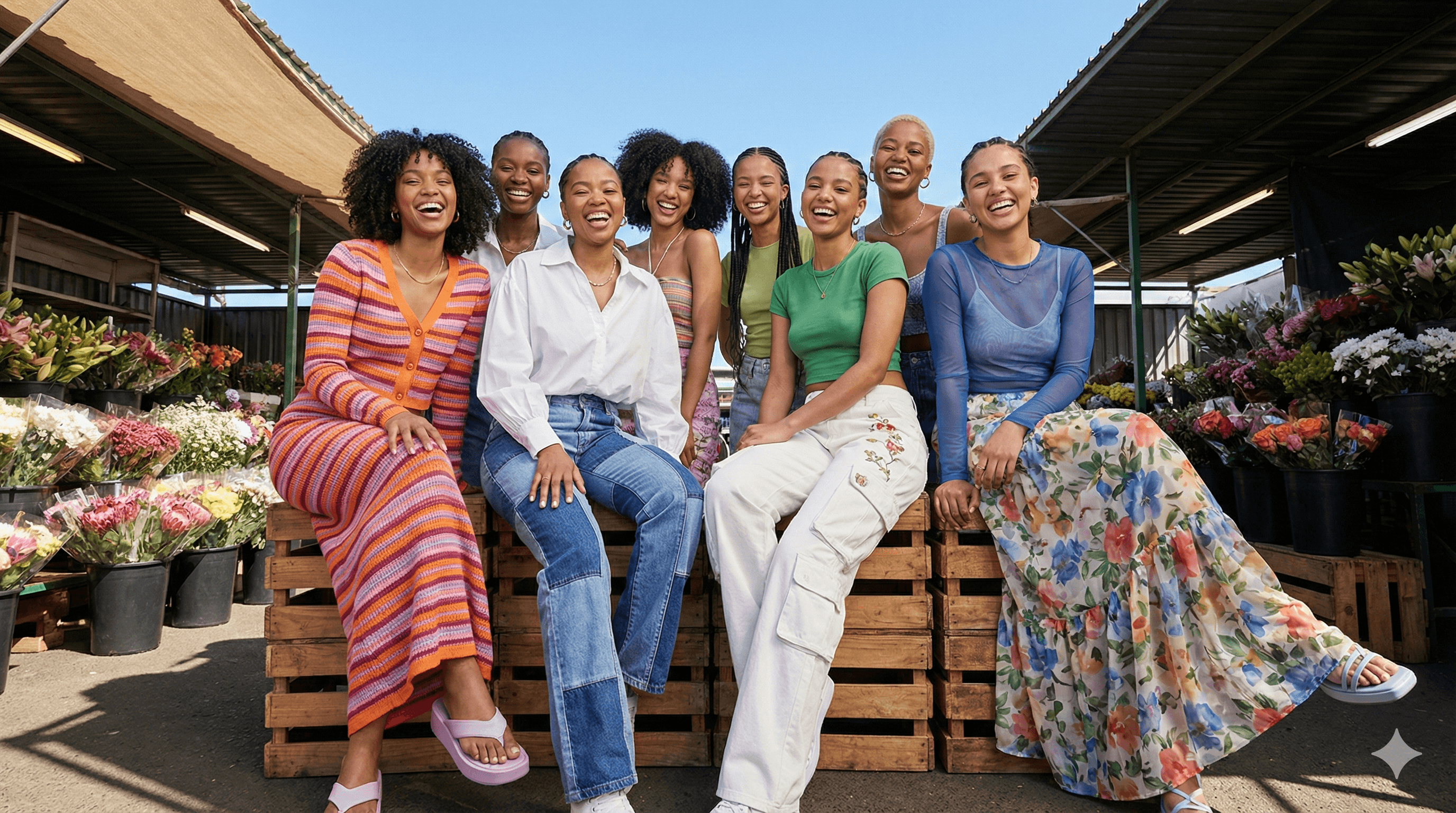
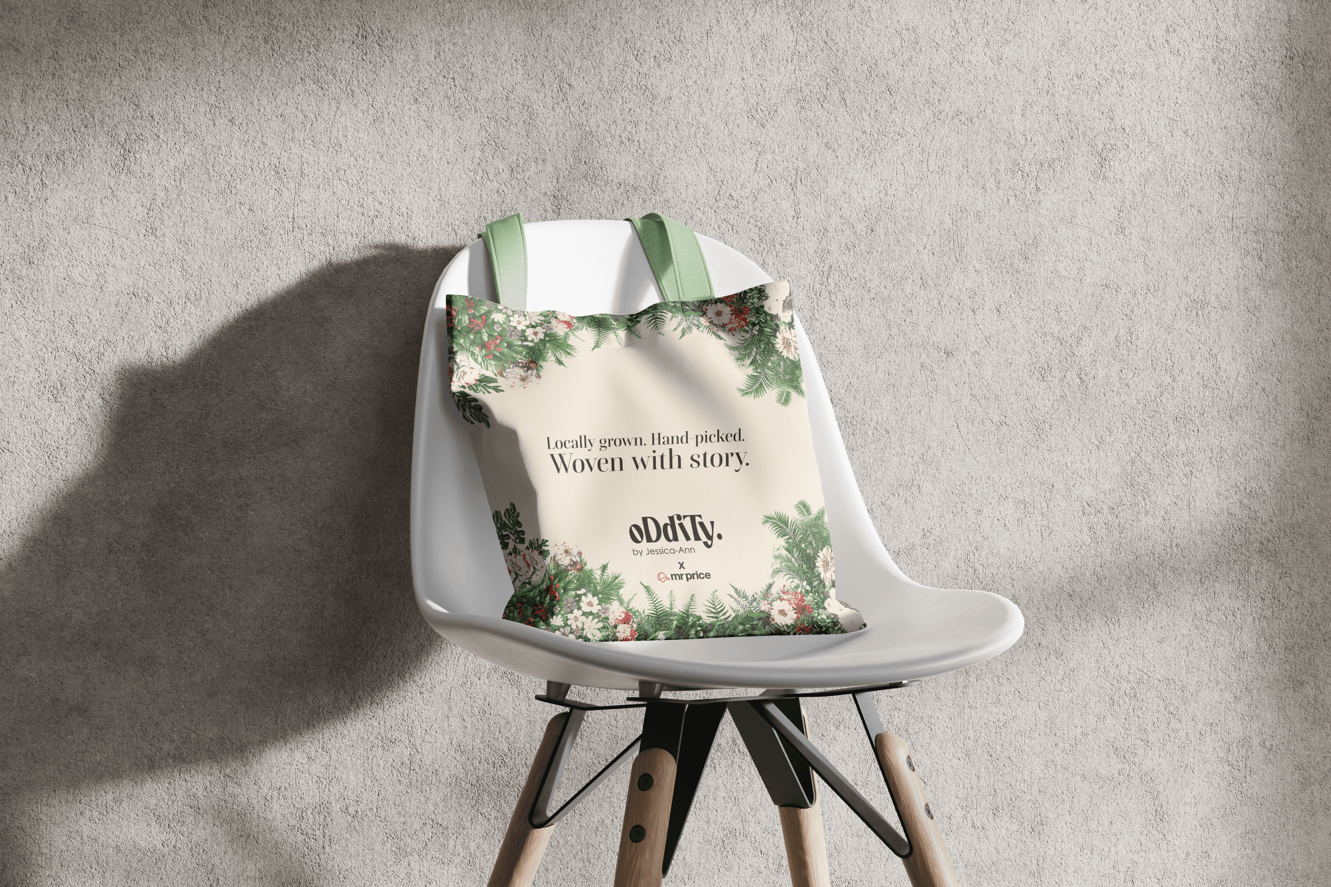
Mr Price tasked us with entrenching the brand as the fashion destination for 15–24-year-olds while launching ODDITY, the label from the 2024 New Talent Search winner, Jessica-Ann Shepherd. To truly champion local talent, we rejected safe, traditional retail presentations and instead grounded ODDITY’s quirky, tactile, mother-daughter-inspired aesthetic in an authentic communal space. By setting the visual narrative in a vibrant South African flower market, we transformed the collection from a standard retail launch into a culturally resonant, high-design experience that celebrates local street culture.
Mr Price tasked us with entrenching the brand as the fashion destination for 15–24-year-olds while launching ODDITY, the label from the 2024 New Talent Search winner, Jessica-Ann Shepherd. To truly champion local talent, we rejected safe, traditional retail presentations and instead grounded ODDITY’s quirky, tactile, mother-daughter-inspired aesthetic in an authentic communal space. By setting the visual narrative in a vibrant South African flower market, we transformed the collection from a standard retail launch into a culturally resonant, high-design experience that celebrates local street culture.
Client
Mr Price
Year
2026
Category
Campaign
Research
Research
Research into our target demographic revealed a critical need to move away from polished studio perfection to truly resonate with Gen Z. The visual strategy embraced an anti-aesthetic that prioritized authenticity, tactile texture, and the raw energy of street culture. We determined that juxtaposing high-fashion knitwear against raw market textures would elevate the perception of the range while keeping the narrative highly accessible.
Research into our target demographic revealed a critical need to move away from polished studio perfection to truly resonate with Gen Z. The visual strategy embraced an anti-aesthetic that prioritized authenticity, tactile texture, and the raw energy of street culture. We determined that juxtaposing high-fashion knitwear against raw market textures would elevate the perception of the range while keeping the narrative highly accessible.
Research
Research into our target demographic revealed a critical need to move away from polished studio perfection to truly resonate with Gen Z. The visual strategy embraced an anti-aesthetic that prioritized authenticity, tactile texture, and the raw energy of street culture. We determined that juxtaposing high-fashion knitwear against raw market textures would elevate the perception of the range while keeping the narrative highly accessible.
Design
Design
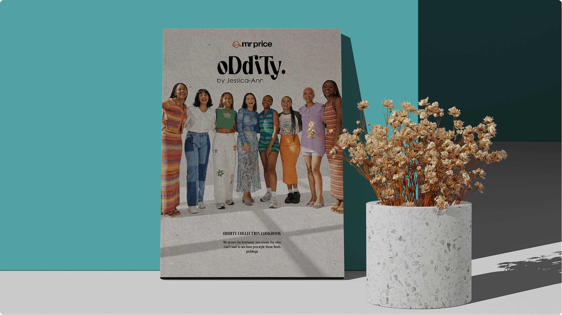
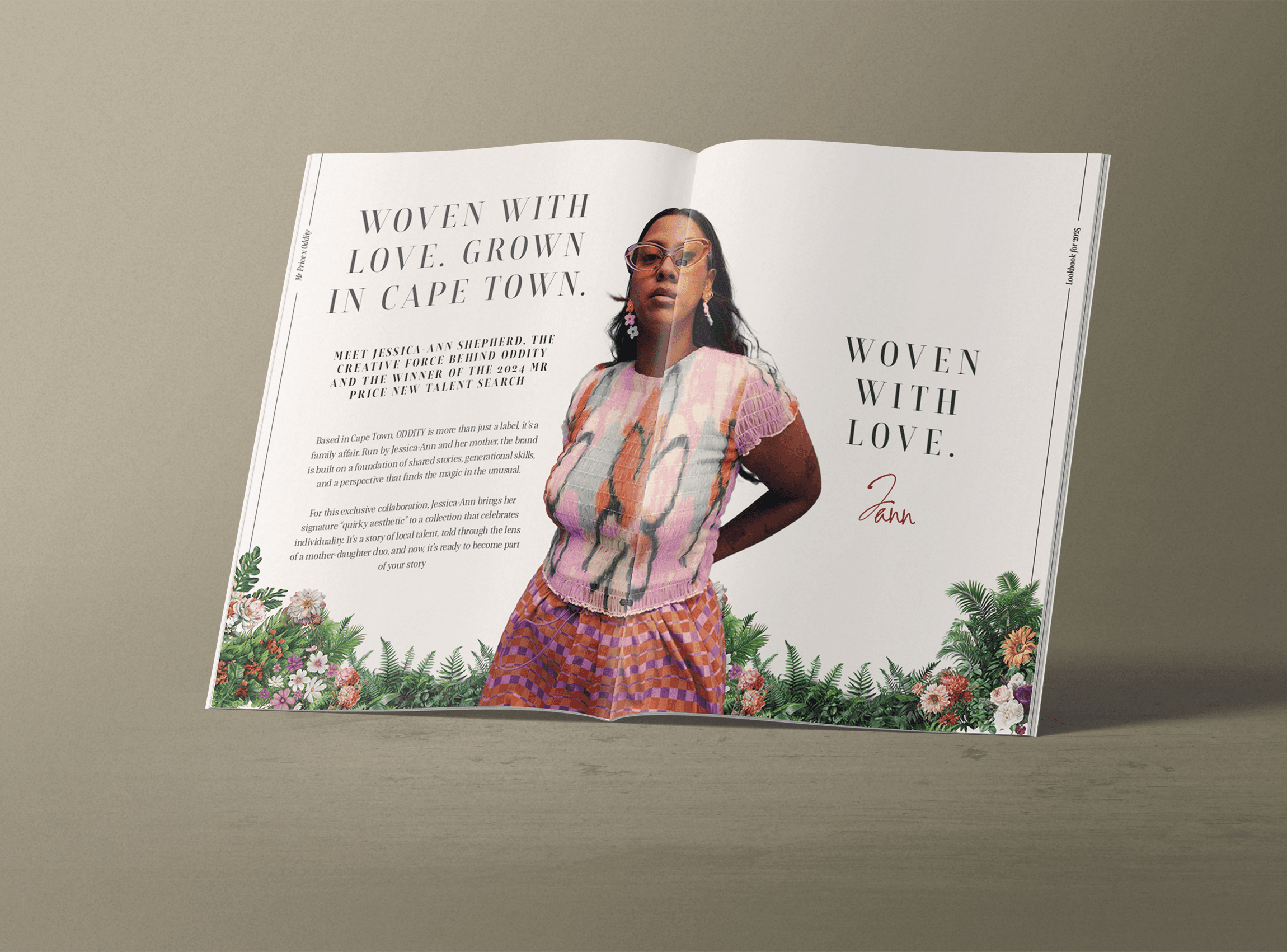
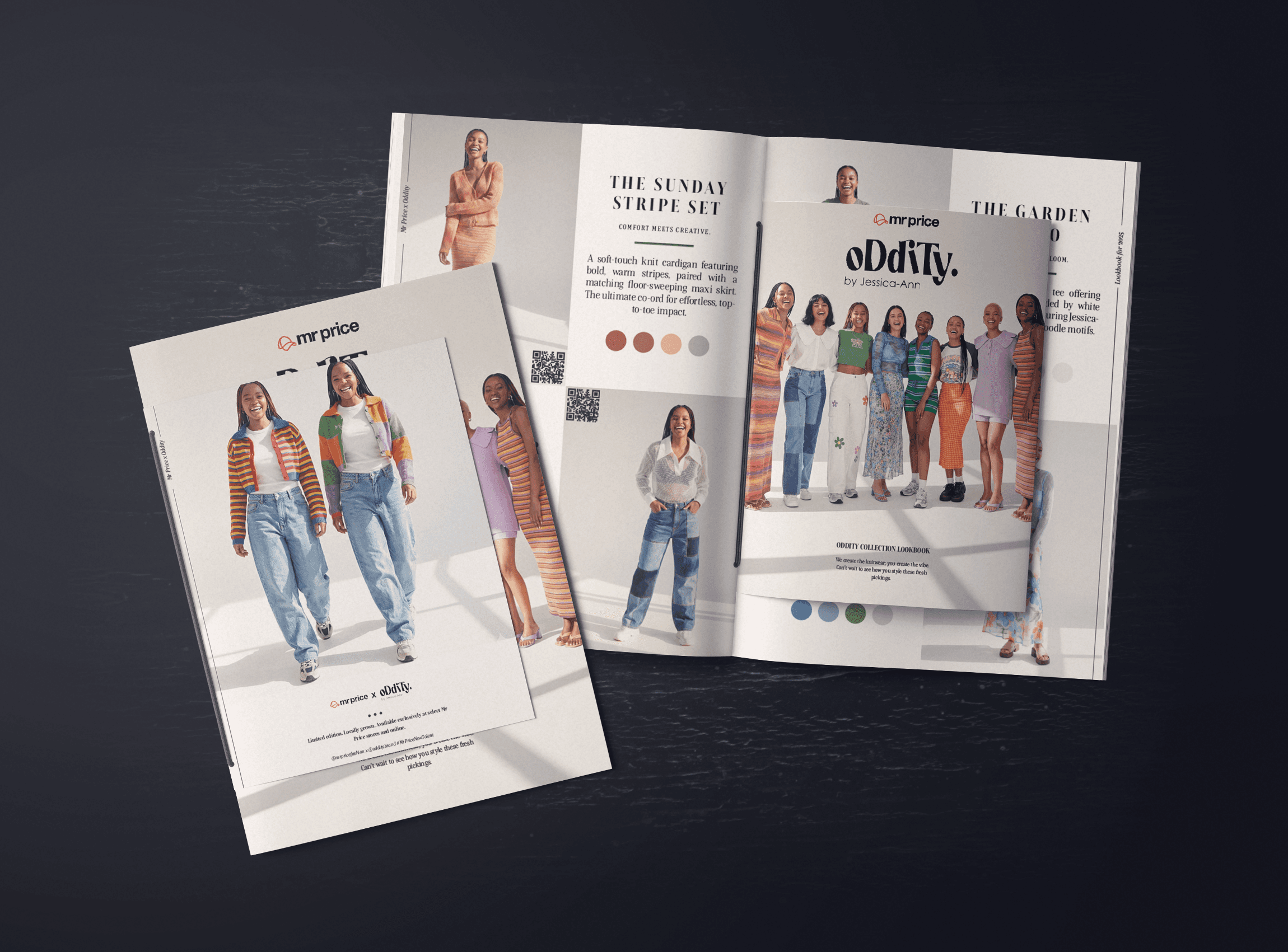
The art direction utilized a high-saturation “golden hour” palette, capturing the collection in warm sunlight to contrast the vibrant knitwear against the organic earth tones of the market. To create a sense of intimacy and movement, the camera direction employed a handheld, 35mm film aesthetic to capture kinetic, in-between moments. We designed a narrative-first lookbook zine that moved away from a standard commercial catalogue, dedicating spreads to the designer’s origin story. For the digital ecosystem, we rejected safe corporate layouts in favor of a kinetic “sticker bomb” aesthetic native to TikTok and Instagram.
The art direction utilized a high-saturation “golden hour” palette, capturing the collection in warm sunlight to contrast the vibrant knitwear against the organic earth tones of the market. To create a sense of intimacy and movement, the camera direction employed a handheld, 35mm film aesthetic to capture kinetic, in-between moments. We designed a narrative-first lookbook zine that moved away from a standard commercial catalogue, dedicating spreads to the designer’s origin story. For the digital ecosystem, we rejected safe corporate layouts in favor of a kinetic “sticker bomb” aesthetic native to TikTok and Instagram.
Design
The art direction utilized a high-saturation “golden hour” palette, capturing the collection in warm sunlight to contrast the vibrant knitwear against the organic earth tones of the market. To create a sense of intimacy and movement, the camera direction employed a handheld, 35mm film aesthetic to capture kinetic, in-between moments. We designed a narrative-first lookbook zine that moved away from a standard commercial catalogue, dedicating spreads to the designer’s origin story. For the digital ecosystem, we rejected safe corporate layouts in favor of a kinetic “sticker bomb” aesthetic native to TikTok and Instagram.


Development
Development
To ensure the visual merchandising aligned with the collection’s architecture, we analyzed the provided product CADs and utilized AI image prompting to generate realistic texture maps. These AI-generated textures were then synthesized into a full Blender 3D render to accurately visualize the spatial experience of our “Greenhouse Concept.” We also developed an innovative emailer layout featuring a vertical scroll interface designed to mimic a long market receipt, guiding the user seamlessly from the origin story into the product offering. To bridge the offline print experience into online sales, the physical lookbook included specific QR codes for every item, creating a frictionless scan-to-shop conversion tool.
To ensure the visual merchandising aligned with the collection’s architecture, we analyzed the provided product CADs and utilized AI image prompting to generate realistic texture maps. These AI-generated textures were then synthesized into a full Blender 3D render to accurately visualize the spatial experience of our “Greenhouse Concept.” We also developed an innovative emailer layout featuring a vertical scroll interface designed to mimic a long market receipt, guiding the user seamlessly from the origin story into the product offering. To bridge the offline print experience into online sales, the physical lookbook included specific QR codes for every item, creating a frictionless scan-to-shop conversion tool.
Development
To ensure the visual merchandising aligned with the collection’s architecture, we analyzed the provided product CADs and utilized AI image prompting to generate realistic texture maps. These AI-generated textures were then synthesized into a full Blender 3D render to accurately visualize the spatial experience of our “Greenhouse Concept.” We also developed an innovative emailer layout featuring a vertical scroll interface designed to mimic a long market receipt, guiding the user seamlessly from the origin story into the product offering. To bridge the offline print experience into online sales, the physical lookbook included specific QR codes for every item, creating a frictionless scan-to-shop conversion tool.

Concept
Concept
To entrench Mr Price as a fashion destination for the 15–24-year-old customer, we developed a strategy that moved far beyond traditional retail presentation. The campaign grounded the ODDITY brand’s quirky aesthetic and mother-daughter storytelling in an authentic, communal setting: the local flower market. By framing the product as “freshly picked” rather than “cheap,” we created a sense of urgency and desirability akin to a limited-edition market drop. This approach directly supported the brief’s requirement to champion local talent by placing the collection in a context that celebrated South African street culture.
To entrench Mr Price as a fashion destination for the 15–24-year-old customer, we developed a strategy that moved far beyond traditional retail presentation. The campaign grounded the ODDITY brand’s quirky aesthetic and mother-daughter storytelling in an authentic, communal setting: the local flower market. By framing the product as “freshly picked” rather than “cheap,” we created a sense of urgency and desirability akin to a limited-edition market drop. This approach directly supported the brief’s requirement to champion local talent by placing the collection in a context that celebrated South African street culture.
Concept
To entrench Mr Price as a fashion destination for the 15–24-year-old customer, we developed a strategy that moved far beyond traditional retail presentation. The campaign grounded the ODDITY brand’s quirky aesthetic and mother-daughter storytelling in an authentic, communal setting: the local flower market. By framing the product as “freshly picked” rather than “cheap,” we created a sense of urgency and desirability akin to a limited-edition market drop. This approach directly supported the brief’s requirement to champion local talent by placing the collection in a context that celebrated South African street culture.
More Works More Works
More Works More Works


©2025 MBUSO BAM
Go Back To Top
©2025 MBUSO BAM
Go Back To Top