
LOCAL/
03:13
03:13

Freedom Hand Sanitiser
Freedom Hand Sanitiser
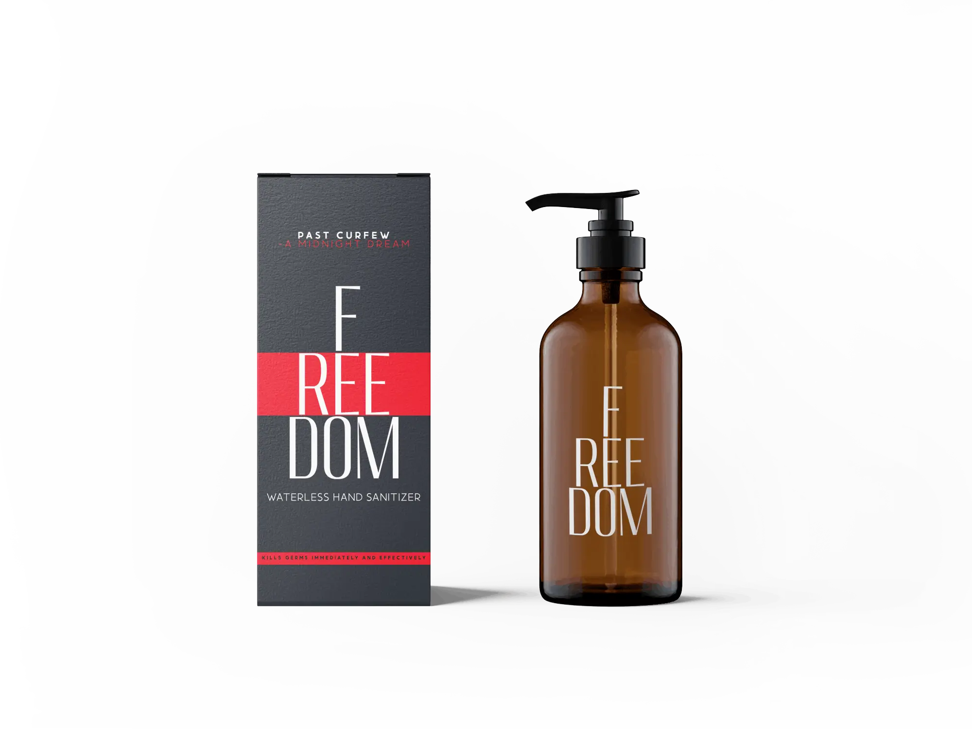
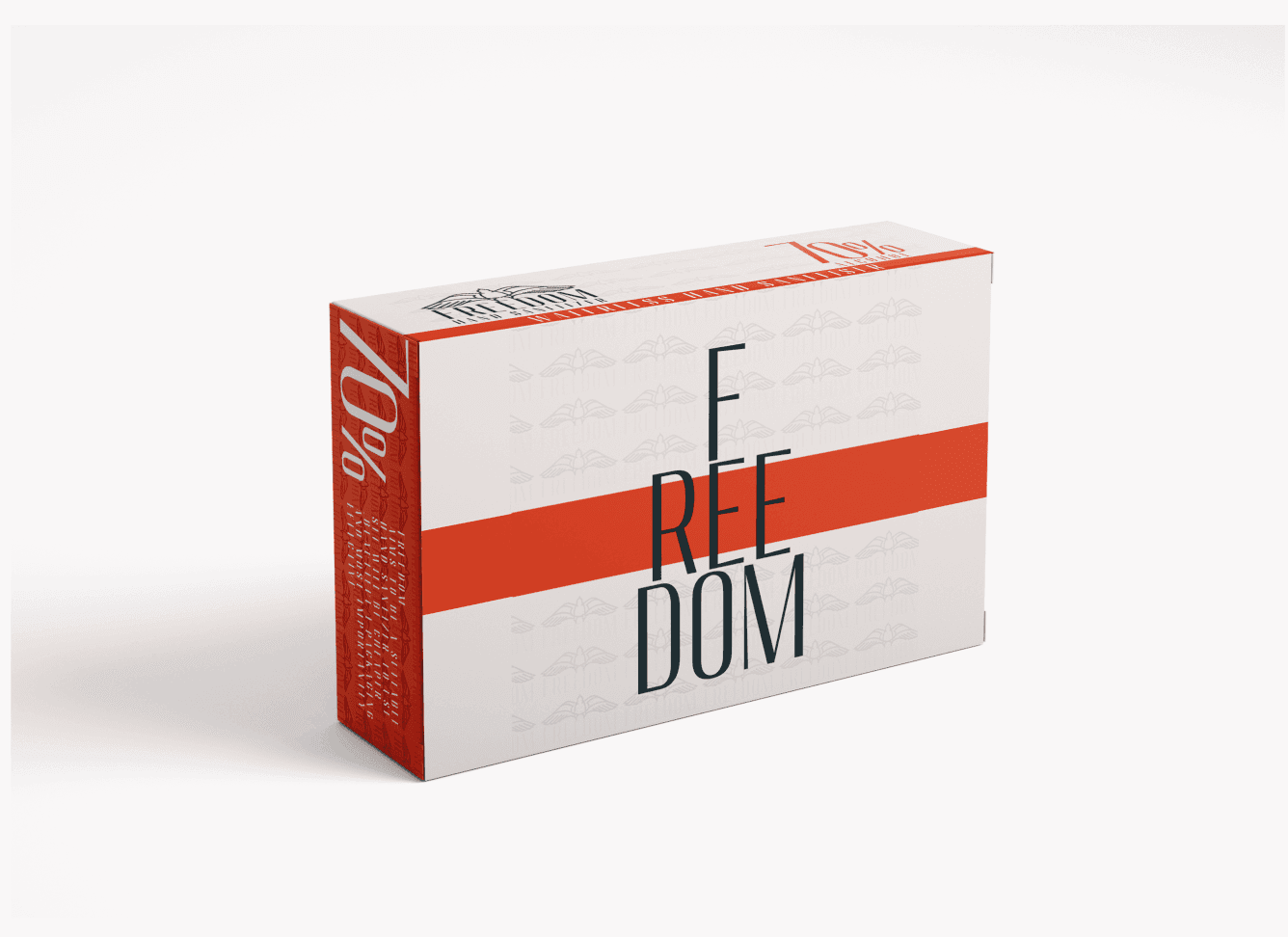
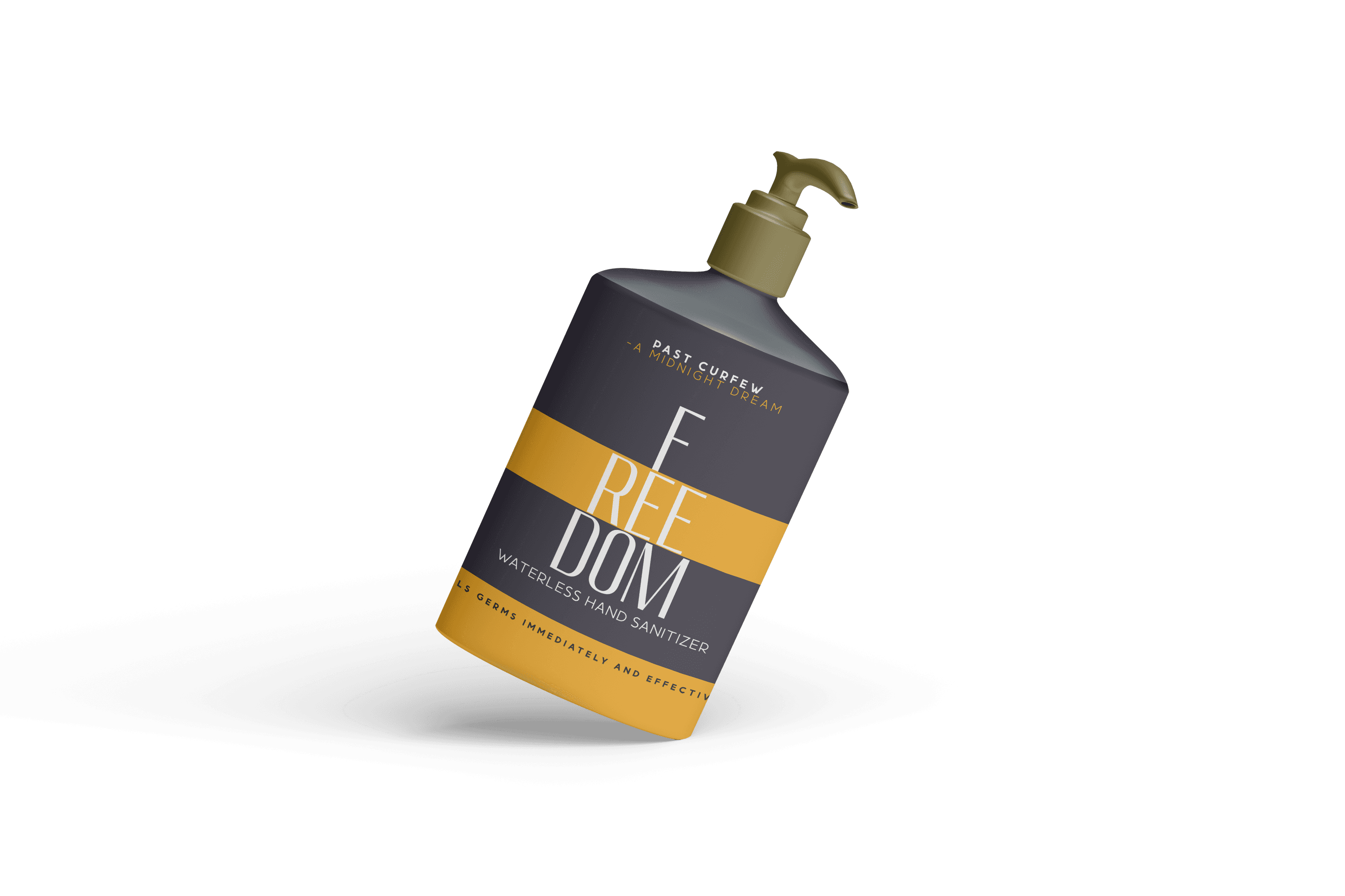
I developed the packaging and landing page design for Freedom Hand Sanitiser, a 70% alcohol, waterless sanitizer created to address the critical need for personal hygiene during the national lockdown in South Africa. The project’s mission was to help South Africans regain a sense of "freedom" through effective protection against germs.
I developed the packaging and landing page design for Freedom Hand Sanitiser, a 70% alcohol, waterless sanitizer created to address the critical need for personal hygiene during the national lockdown in South Africa. The project’s mission was to help South Africans regain a sense of "freedom" through effective protection against germs.
Client
Freedom Hand Sanitiser
Year
2023
Category
Branding

Research
Research
The project was born out of the national lockdown that began on March 23, 2020. The brief was to create a brand identity that was both trustworthy and hopeful, providing a sense of security and freedom that was lost during this period. The design needed to be clean, clear, and reassuring, communicating efficacy and reliability to a nationwide audience.
The project was born out of the national lockdown that began on March 23, 2020. The brief was to create a brand identity that was both trustworthy and hopeful, providing a sense of security and freedom that was lost during this period. The design needed to be clean, clear, and reassuring, communicating efficacy and reliability to a nationwide audience.
Research
The project was born out of the national lockdown that began on March 23, 2020. The brief was to create a brand identity that was both trustworthy and hopeful, providing a sense of security and freedom that was lost during this period. The design needed to be clean, clear, and reassuring, communicating efficacy and reliability to a nationwide audience.
Design
Design
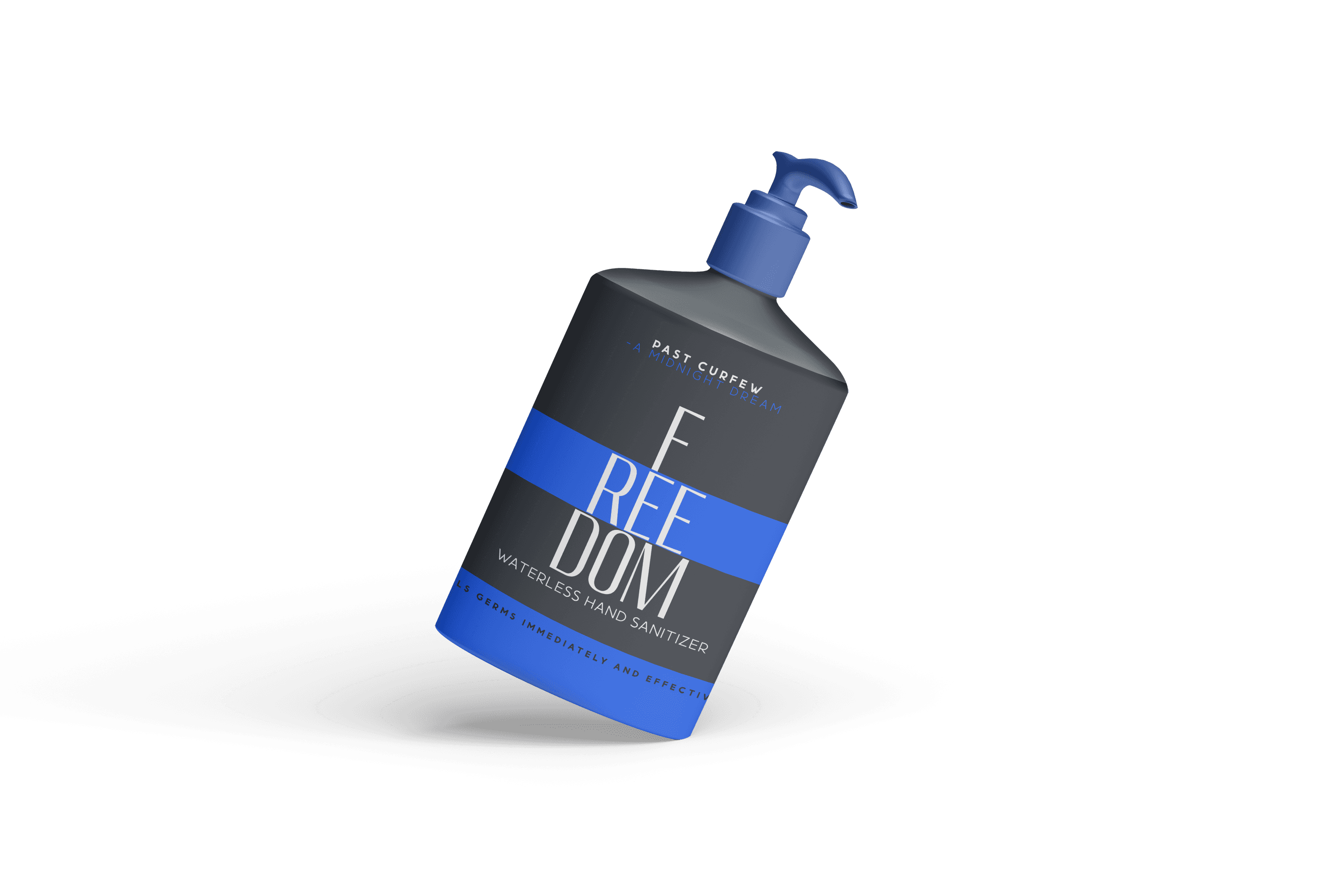
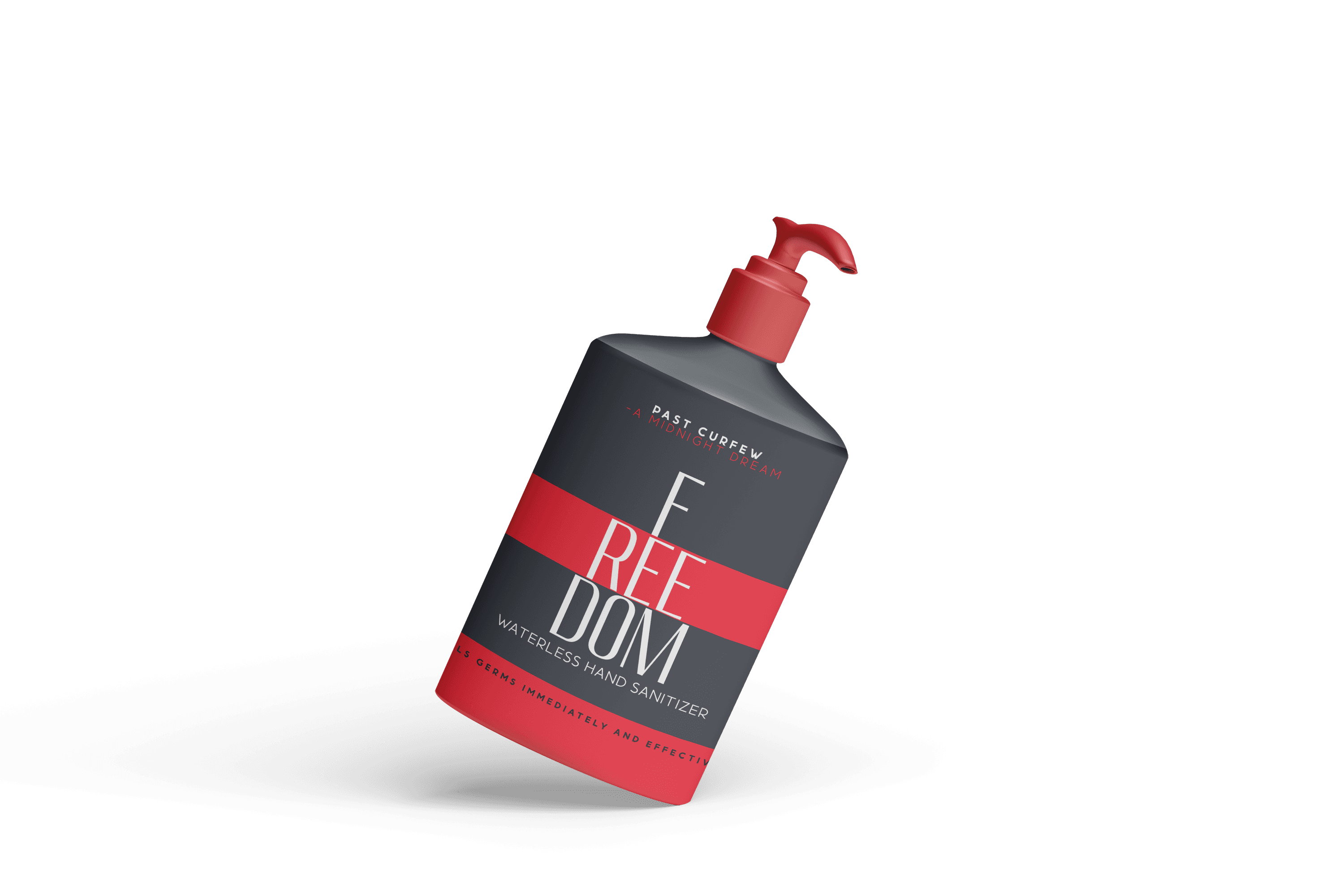
My design approach focused on clarity and a positive, reassuring message. The packaging design was simple and direct, ensuring that key information, such as the 70% alcohol content, was immediately visible. The visual identity was built to be easily recognizable and to instill a sense of trust in consumers during a time of great uncertainty.
My design approach focused on clarity and a positive, reassuring message. The packaging design was simple and direct, ensuring that key information, such as the 70% alcohol content, was immediately visible. The visual identity was built to be easily recognizable and to instill a sense of trust in consumers during a time of great uncertainty.
Design
My design approach focused on clarity and a positive, reassuring message. The packaging design was simple and direct, ensuring that key information, such as the 70% alcohol content, was immediately visible. The visual identity was built to be easily recognizable and to instill a sense of trust in consumers during a time of great uncertainty.


Development
Development
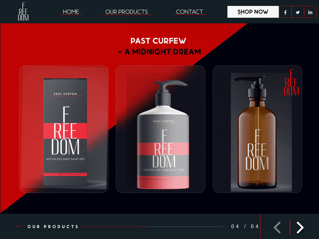
I developed both the physical packaging design and the digital landing page. The landing page was created to serve as a direct-to-consumer platform where customers could easily purchase the product. This required a user-friendly interface that streamlined the buying process. The development process focused on creating a cohesive brand experience across both physical and digital touchpoints.
I developed both the physical packaging design and the digital landing page. The landing page was created to serve as a direct-to-consumer platform where customers could easily purchase the product. This required a user-friendly interface that streamlined the buying process. The development process focused on creating a cohesive brand experience across both physical and digital touchpoints.
Development
I developed both the physical packaging design and the digital landing page. The landing page was created to serve as a direct-to-consumer platform where customers could easily purchase the product. This required a user-friendly interface that streamlined the buying process. The development process focused on creating a cohesive brand experience across both physical and digital touchpoints.
Concept
Concept
The guiding concept was "Freedom Back." The brand story was anchored in the idea that a simple product could provide a powerful sense of control and safety, helping people feel a return to normalcy. The design and messaging worked together to convey that Freedom Hand Sanitiser was more than just a product; it was a tool for empowerment and peace of mind during a challenging time.
The guiding concept was "Freedom Back." The brand story was anchored in the idea that a simple product could provide a powerful sense of control and safety, helping people feel a return to normalcy. The design and messaging worked together to convey that Freedom Hand Sanitiser was more than just a product; it was a tool for empowerment and peace of mind during a challenging time.
Concept
The guiding concept was "Freedom Back." The brand story was anchored in the idea that a simple product could provide a powerful sense of control and safety, helping people feel a return to normalcy. The design and messaging worked together to convey that Freedom Hand Sanitiser was more than just a product; it was a tool for empowerment and peace of mind during a challenging time.
More Works More Works
More Works More Works


©2025 MBUSO BAM
Go Back To Top
©2025 MBUSO BAM
Go Back To Top